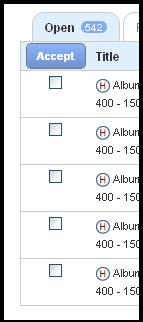
 Helium on Wednesday made it easier for users to bulk accept and withdraw from assignements by clicking multiple check box and choosing the “Accept” or “Withdraw” buttons.
The system is meant to spur more use among Helium users, however they warn that you must choose “Accept” on assignments before moving onto a second page or the assignments you have checked will not be claimed.
Attempting to streamline the question process Helium has also added question mark icons throughout their pages to explain what Announcements, My Assignments and other sections mean. Clicking on each question mark shows users an explanation of each section, making it easier for new users to learn the system.
Programmers at Helium and other “freelance for hire” sites have been working non-stop to improve their platform ever since the Google Panda content farm algorithm caused writers to complain about drops in their monthly revenues, sometimes by as much as 50% on certain sites.
According to the company they have also made changes to various other sections on their platform:
We’ve also added some new details associated with each title. You can now see the title, article type, number of submissions (meaning how many other writers have claimed this title), payment, when it was posted and when it closes. The number of submissions area, for example 1/5, is a new feature and one members really wanted.
Sorting assignments also got an overhaul. Now simply click once on “Payment,” “Posted On” or “Closes” and it will sort titles from, for example, highest paying to lowest paying, or lowest paying to highest paying title.
In Open Assignments you can filter titles by channel. In Restricted Assignments you can filter by Marketplace Approved or Marketplace Premier titles. You can also search for a title in the “Title Search” bar.
Do you write for Helium? If you do let us know what you think about the company’s platform changes. At least some users are really enjoy the new layout, Kevin Byrom says on the company’s official platform release post:
These changes are outstanding and create a more user-friendly experience for all members. I love the new look and ease of use. Great job!
Happy writers are always good for your platform, it looks like Helium may be moving in the right direction in that respect.


